Histogram
The histogram can be used to provide the distribution of our data. Using the positive_cases_covid_d dataset, let’s plot a histogram of the age of dead individuals.
In this case, we will use the columns:
edadthat refers to the age of the individual,unidad_medidato ensure that the value inedadrepresents years, andestadoto filter by theFallecido(dead individuals).
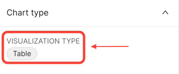
To do this, open the positive_cases_covid_d dataset and click on the Table value to change the VISUALISATION TYPE:
 {width=300px}
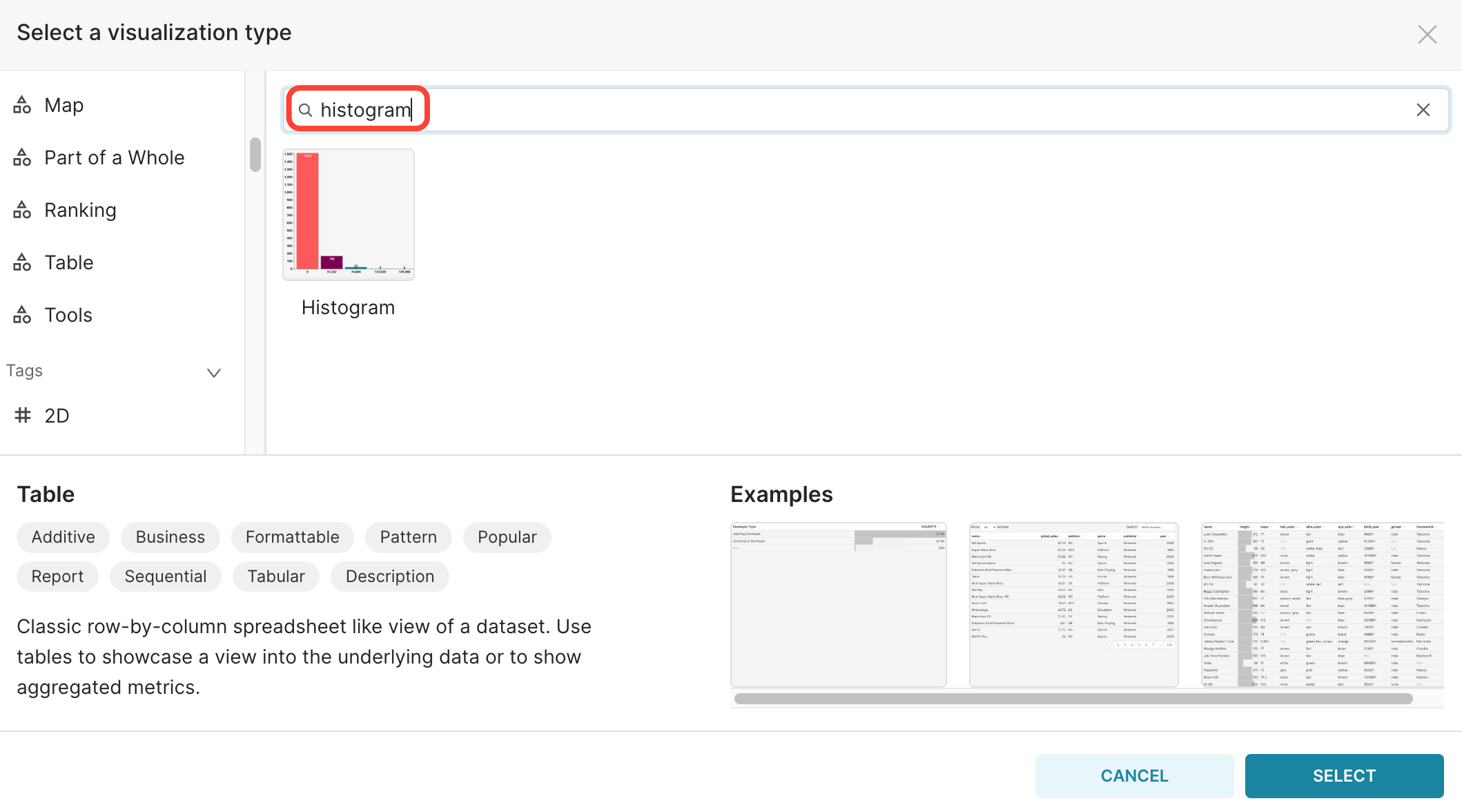
In the window that will open, type histogram:
 {width=750px}
Click on the histogram and on the SELECT button.
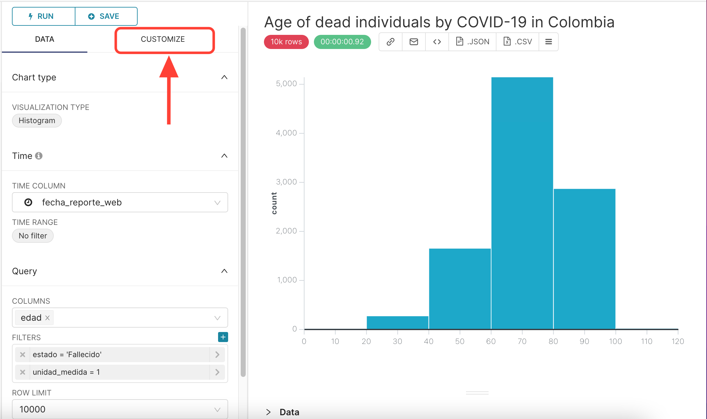
In the Explore Page, select the column edad in the COLUMNS field and apply the two filters presented below:
So, your final query configuration is:
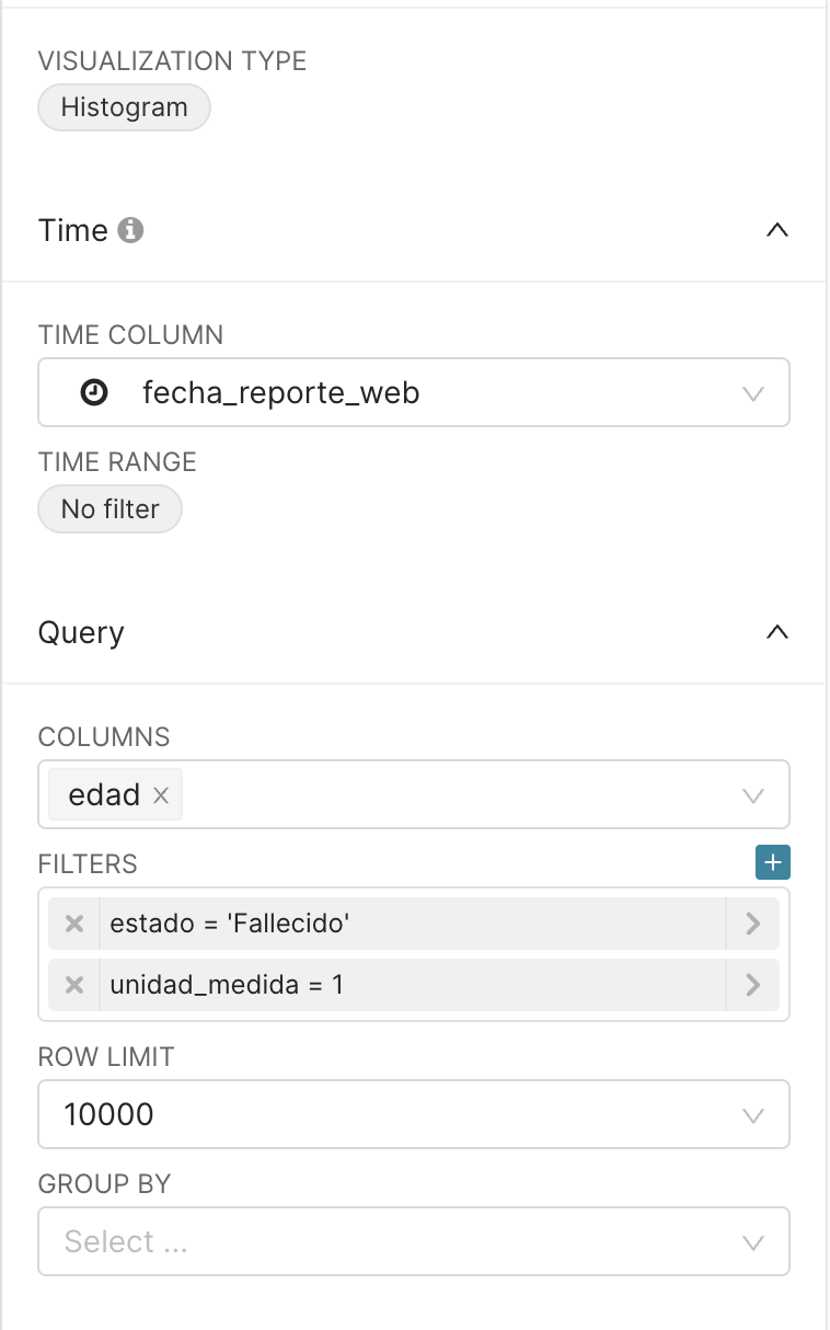 {width=300px}
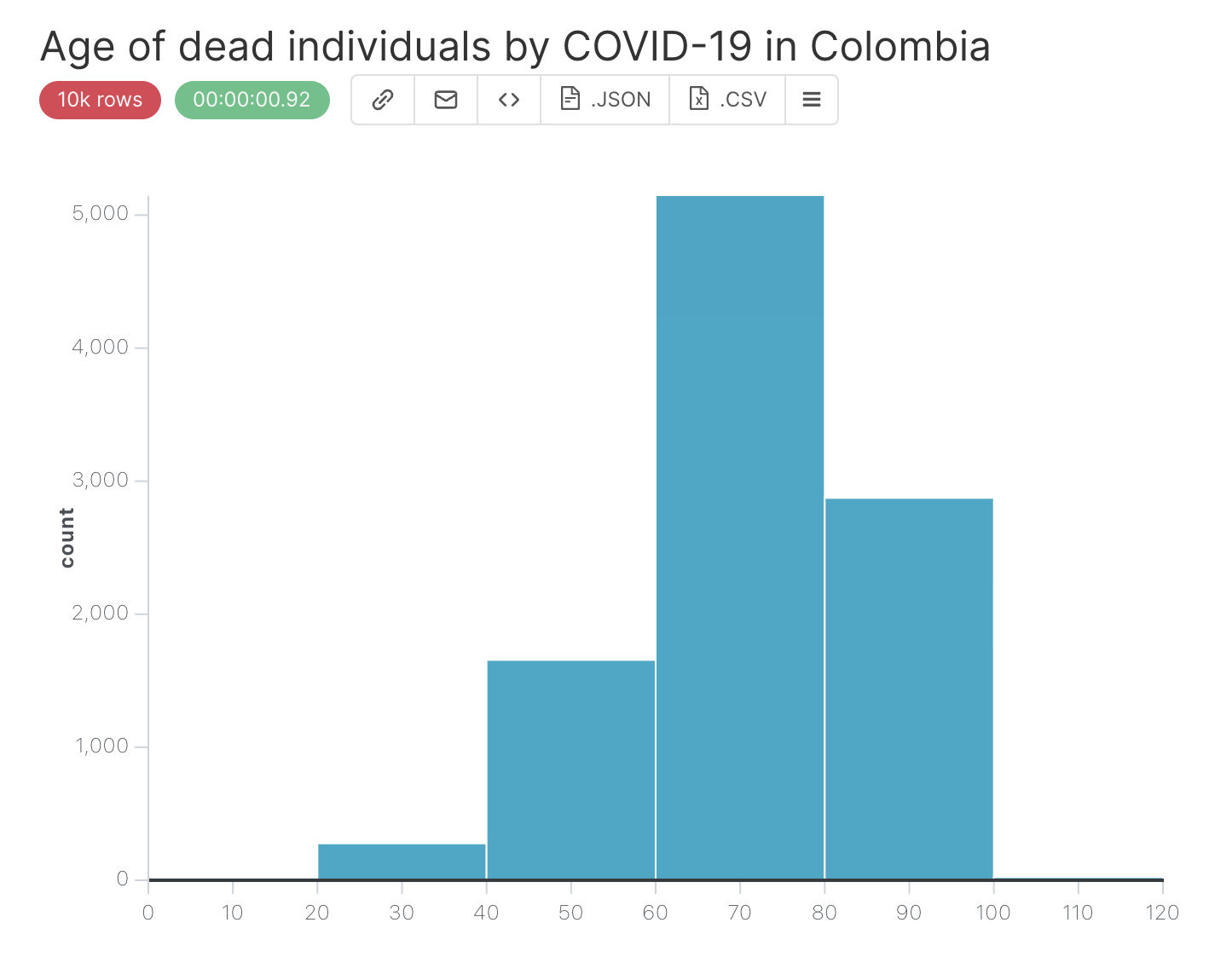
After clicking on the RUN QUERY button, this will be the displayed result:
 {width=500px}
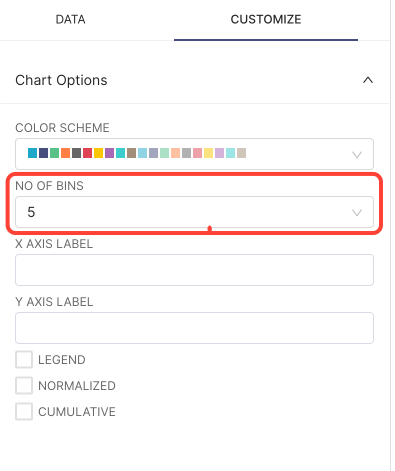
To change the number of bins in the histogram, go to the CUSTOMIZE tab:
 {width=500px}
and change the NO OF BINS field:
 {width=300px}
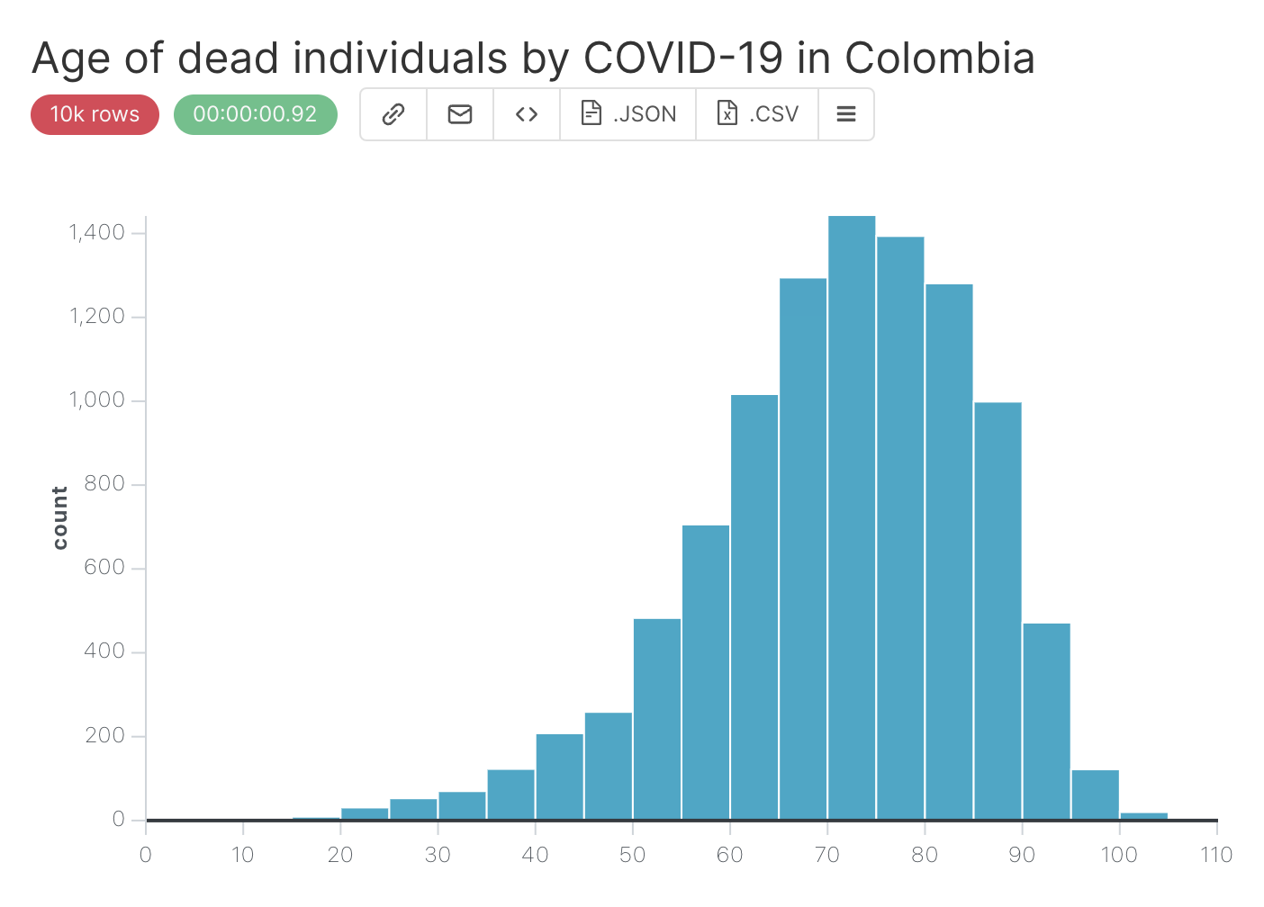
After setting NO OF BINS to 20, you will get the result below:
 {width=500px}
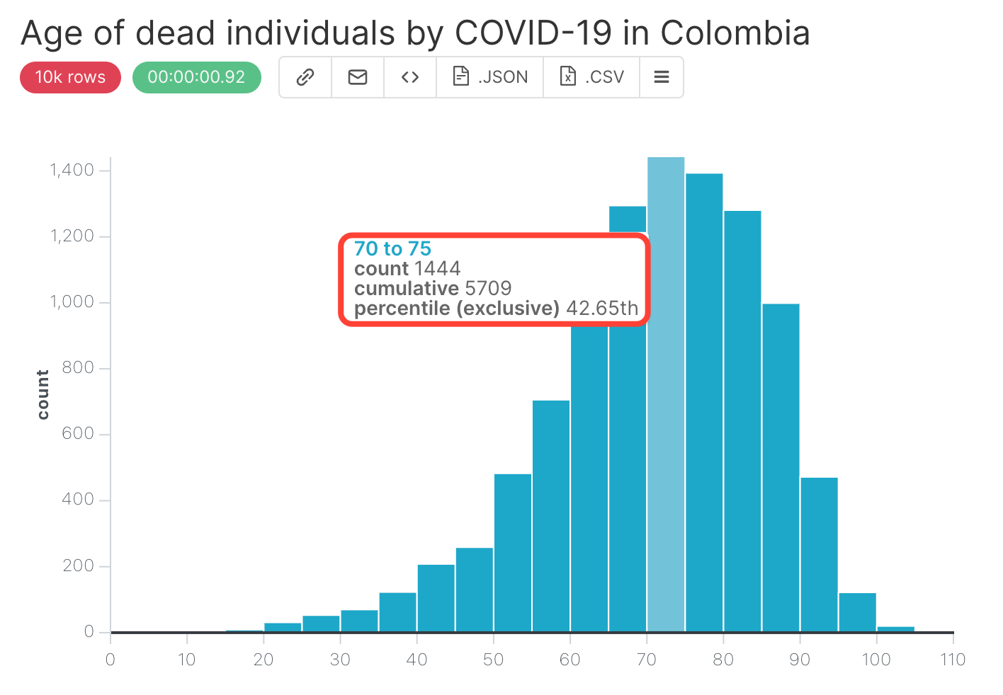
If you hover the mouse over the bars, you get the information about what range of the edad (age) the bar represents, what is the exact count, cumulative, and percentile that this bar represents:
 {width=500px}
It is now time to :
Specify a title for the chart, for instance
Age of dead individuals by COVID-19 in Colombia,Save it, by clicking on
+SAVEbutton in the middle panel.