Boxplot
The boxplots can be used to summarise the statistics of the values in a column. Using the positive_cases_covid_d dataset, let’s plot a histogram of the age of dead individuals.
In this case, we will use the columns:
edadthat refers to the age of the individual,unidad_medidato ensure that the value inedadrepresents years, andestadoto filter by theFallecido(dead individuals).
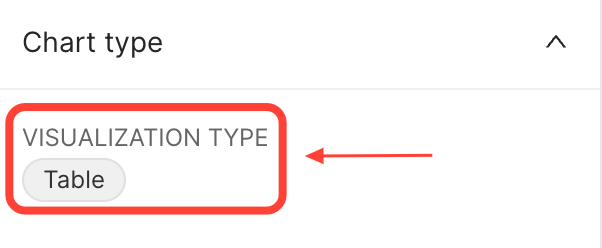
To do this, open the positive_cases_covid_d dataset and click on the Table value to change the VISUALISATION TYPE:
 {width=300px}
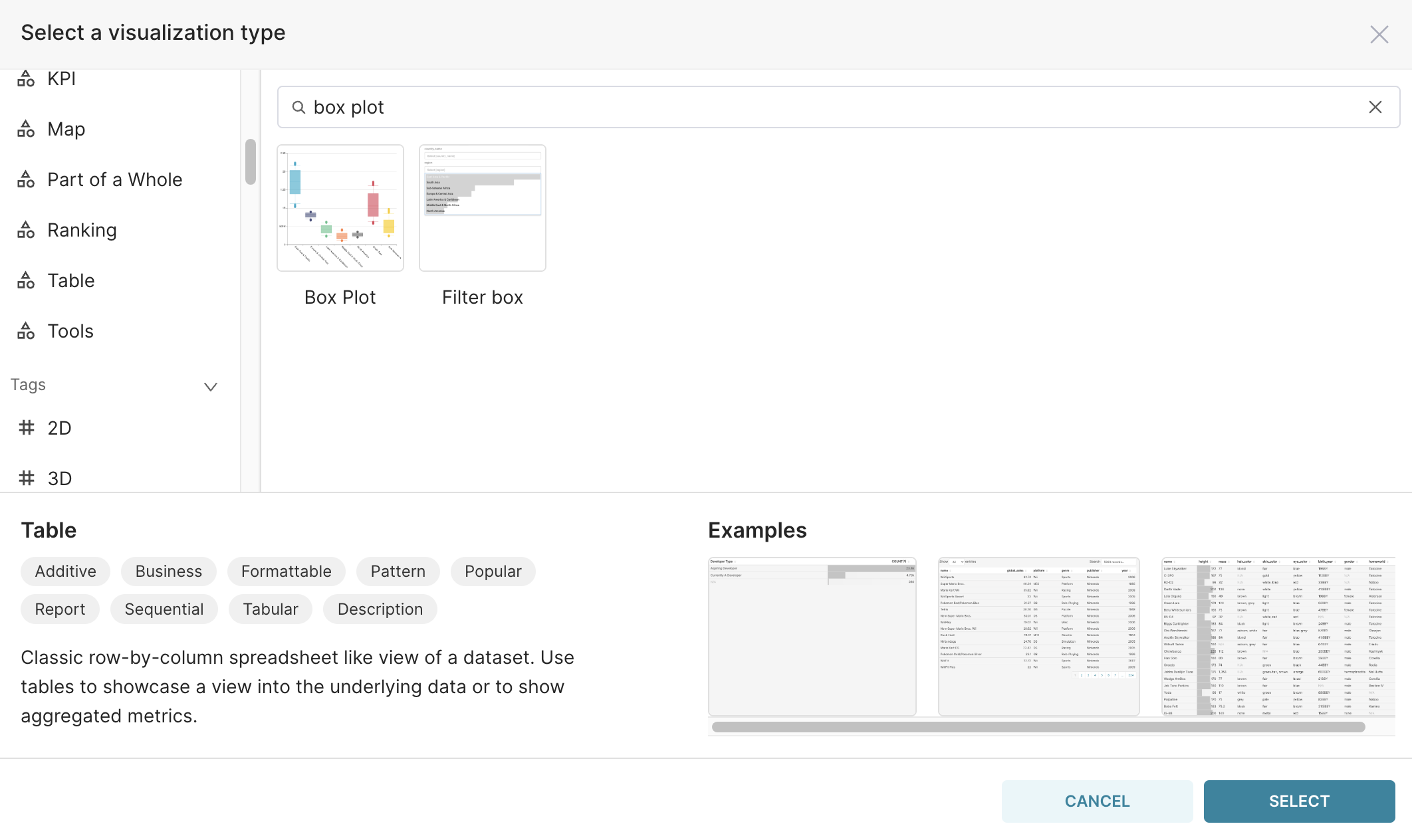
In the window that will open, type box plot:
 {width=750px}
Click on the Box Plot and on the SELECT button.
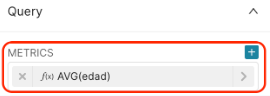
For this chart, the METRICS field is mandatory. As we are interested in the age distribution, let’s start by setting the METRICS field to AVG(edad) in the Query section.
 {width=300px}
And RUN QUERY. You should then get the following result, with only one box plot representing all age values in our dataset:
 {width=500px}
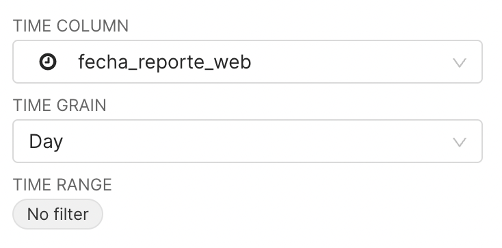
::: key-point By default, the temporal column defined in TIME COLUMN and the TIME GRAIN are used to compute the value in METRICS. :::
In the result above, it means that :
all patients’ records were first grouped by
Daybased on thefecha_reporte_webcolumn, thenthe average ages (METRICS =
AVG(edad)) by day were computed, and eventuallythe distribution of these average ages was plotted
::: practice To convince yourself about the explanation above, change the operator in the METRICS field from AVG to SUM, and see how it impacts the plotted distribution. :::
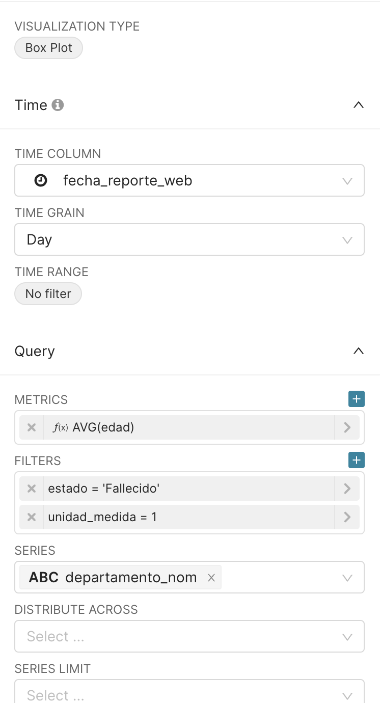
Now, to see the distribution of the age of individuals, without prior aggregation by time, we will fill the field DISTRIBUTE ACROSS with the id_de_caso column, representing the unique case ID of each record in our dataset . This will ensure that the box plot will use the age of each individual patient.
As a consequence of using DISTRIBUTE ACROSS = id_de_caso, selecting the AGGREGATE operator in METRICS to be SUM or AVG will not change the result distribution. Let’s then keep METRICS as AVG(edad).
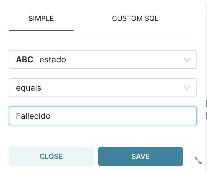
To get the age in years only for the dead individuals, let’s apply the two filters presented below:
 {width=300px}
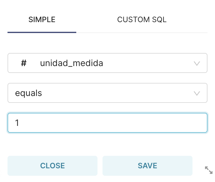 {width=300px}
In the SERIES field, we will select the column with unique values to be shown along the X axis. For each unique value in this column, a box plot will be computed.
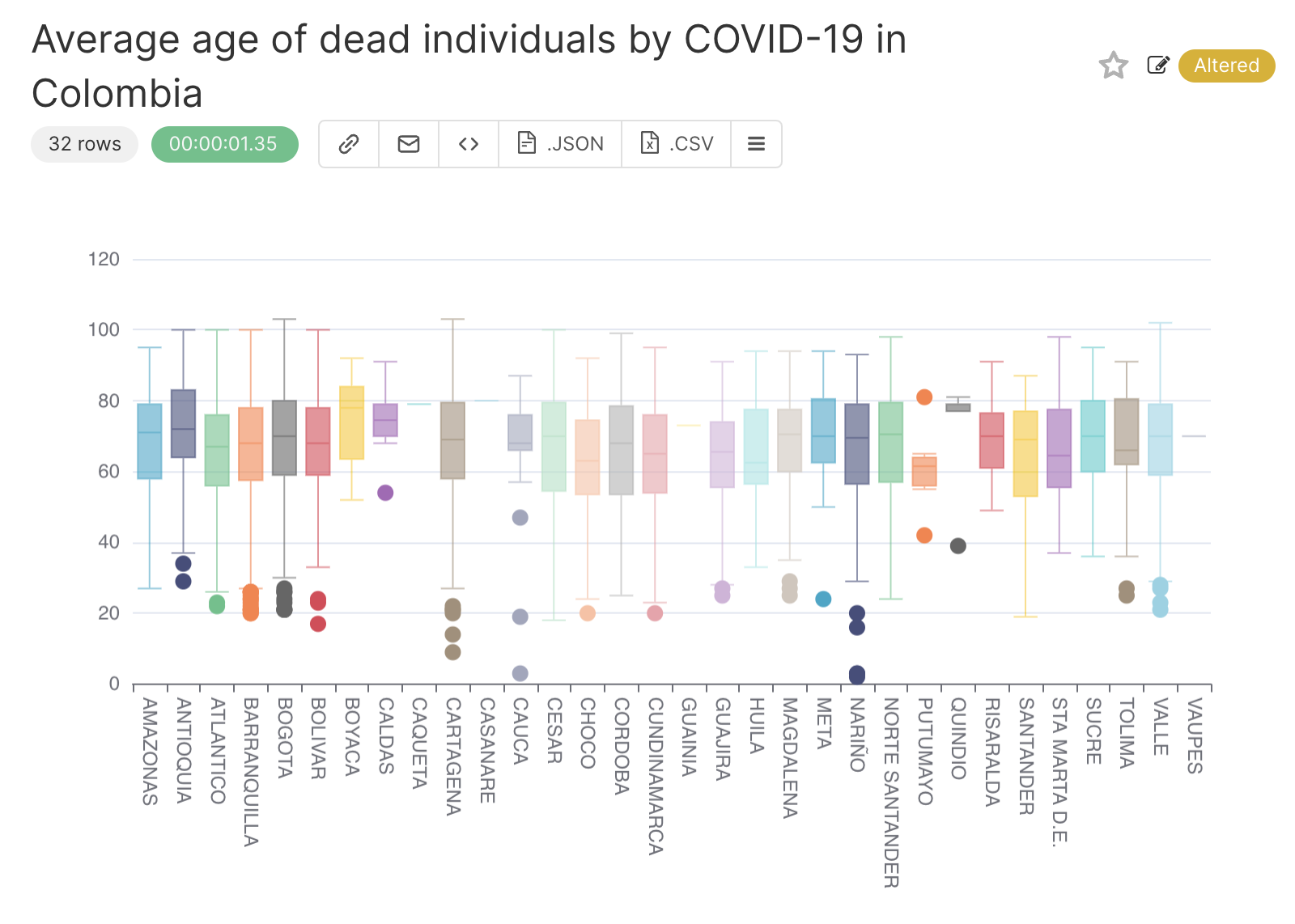
To get one box plot for each department in Colombia, let’s set SERIES to the column departamento_nom. So, your final query configuration is the following:
 {width=300px}
After clicking on the RUN QUERY button, this will be the received result:
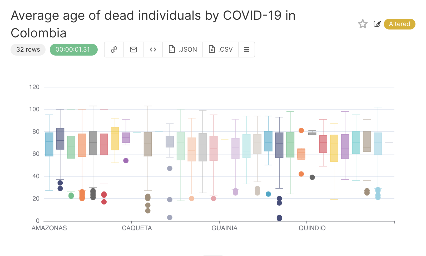 {width=500px}
To see the name of the departamento_nom associated with each box plot, we can rotate the X axis labels. To do this, go to the CUSTOMISE tab:
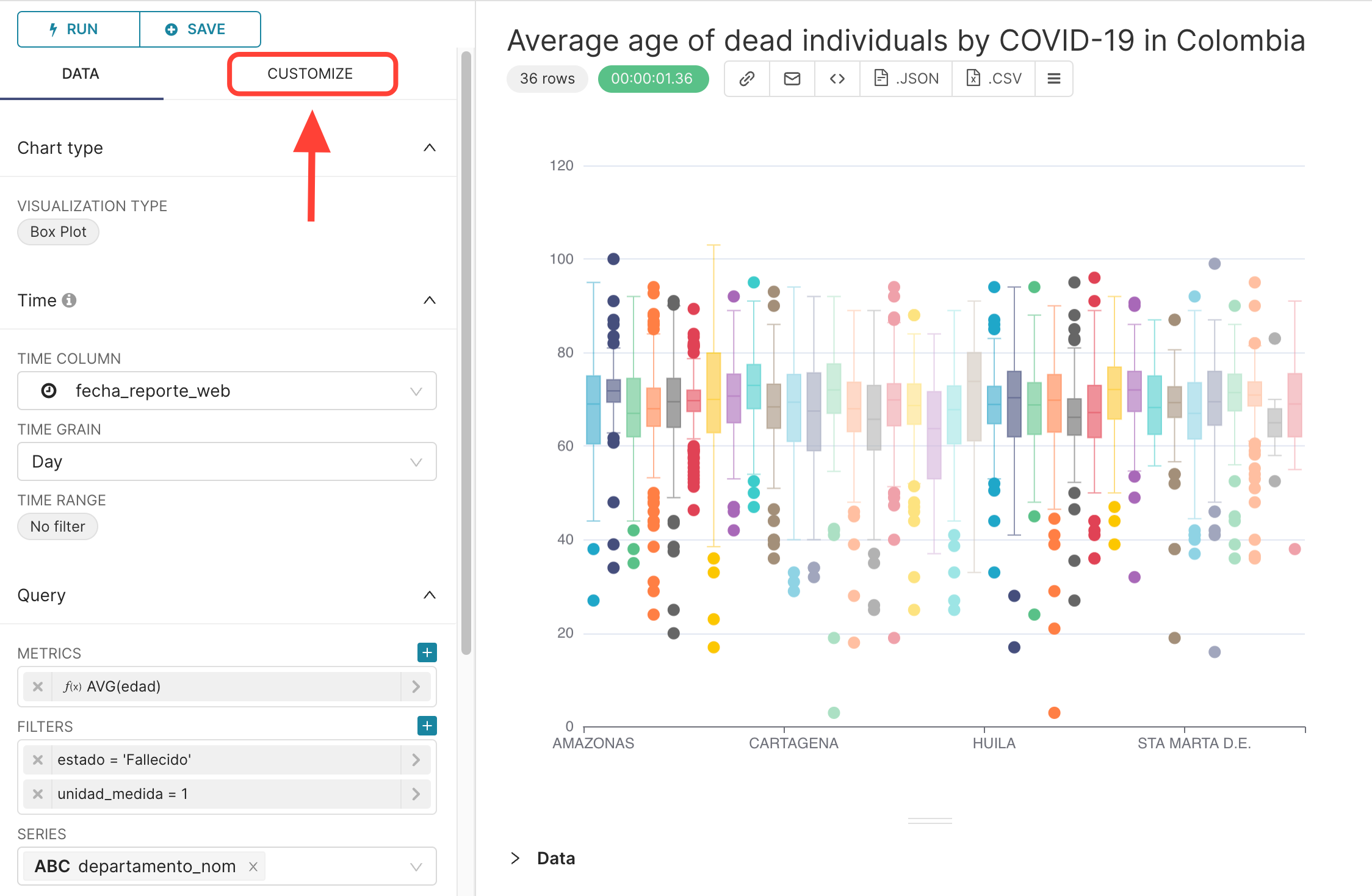 {width=500px}
and change the X TICK LAYOUT field to 90º:
![]images//box_x_tick.png){width=300px}
and that’s the result:
 {width=500px}
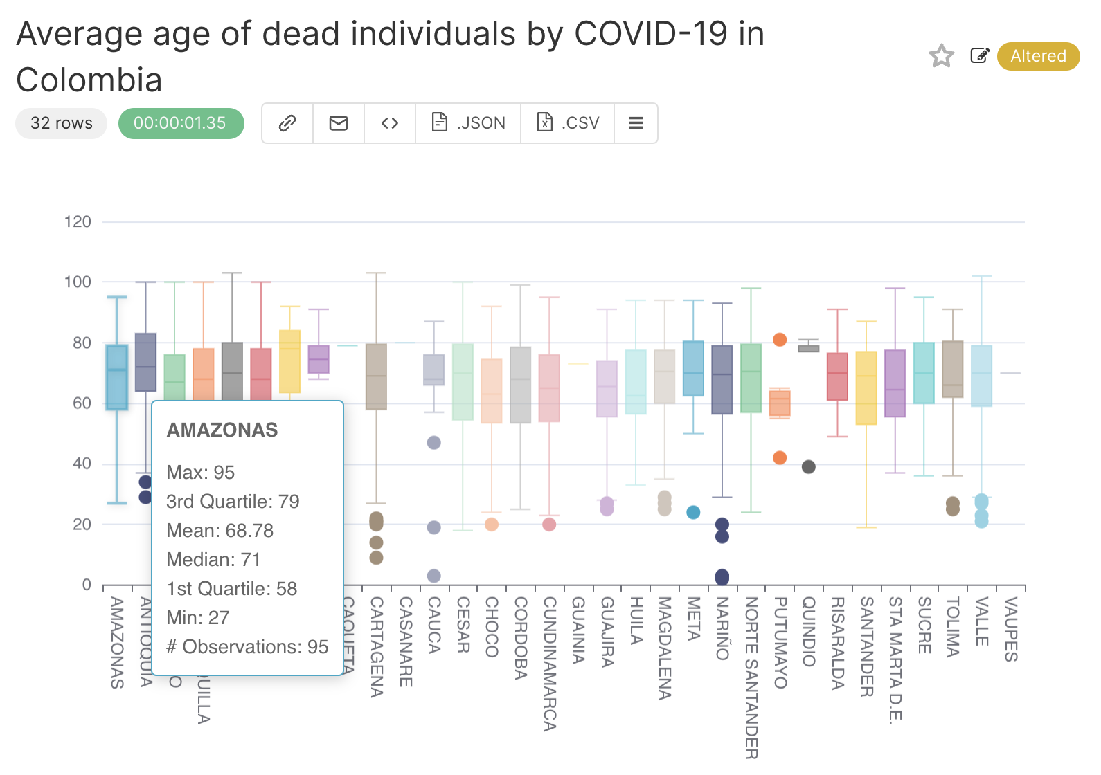
If you hover the mouse over a box plot, you get the information about the quartiles, observation, and outliers:
 {width=500px}
It is now time to :
Specify a title for the chart, for instance
Age of dead individuals by COVID-19 in Colombia,Save it, by clicking on
+SAVEbutton in the middle pane.
You can also change the time range considered in the region below:
 {width=300px}
And in the field below, you can change the type of box plot:
 {width=300px}
By default, it uses Tukey, where the min and max values are at most 1.5 times the IQR (interquartile range) from the first quartile (25 percentile) and third quartile (75 percentile), respectively. The other available options are:
Min/max (no outliers);2/98 percentiles;9/91 percentiles.