Data Querying, Analysis, and Visualizations
If you have you public key registered with the EpigraphHub server, you can easily connect directly to the database from your programming environment.
First you need to establish an encrypted connection using the following command:
Direct access to the database
ssh -f epigraph@epigraphhub.org -L 5432:localhost:5432 -NC
This command let’s you access the database as if it was a local database.
Below are instructions about how to fetch data for analysis
Using Python
In a Python environment we will use two libraries: Pandas and SQLAlchemy.
import pandas as pd
from sqlalchemy import create_engine

engine = create_engine("postgres://epigraph:epigraph@localhost:5432/epigraphhub")
Then suppose you want to download the “Our World in Data” covid table:
owid = pd.read_sql_table('owid_covid', engine, schema='public')
Using R
In R-studio or the R console, we will need the following packages: RPostgreSQL.
# install.packages("RPostgreSQL")
require("RPostgreSQL")

# loads the PostgreSQL driver
drv <- dbDriver("PostgreSQL")
# creates a connection to the postgres database
# note that "con" will be used later in each connection to the database
con <- dbConnect(drv,
                dbname = "epigraphhub",
                host = "localhost",
                port = 5432,
                user = "epigraph",
                password = 'epigraph')
Then to fetch the “Our World in Data” covid table:
# query the data from postgreSQL
df_owid <- dbGetQuery(con, "SELECT * from public.owid_covid")
That’s it! you can now explore the data on your local computer as you wish.
Access through the API
In order to access contents via the Hub’s API, it is a bit more involved, and it gives access mostly to metadata instead of raw data.
Getting the authentication token
you need to authenticate using your user and password you will get a token following this authentication that you can save and use for future requests.
import requests
import json

base_url = 'https://epigraphhub.org/api/v1/'
payload = {'username':'guest', 'password':'guest','provider':'db'}

r = requests.post('https://epigraphhub.org/api/v1/security/login', json=payload)
access_token = r.json()
the content of access_token will look like this:
{'access_token': 'eyJ0eXAiOiJKV1QiLCJhbGciOiJIUzI1NiJ9.eyJpYXQiOjE2Mzc3NTYzMjksIm5iZiI7MTYzNzc2NjMyOSwianRpIjoiZjEyNGVlMjEtNmUwOS00ZmNmLTgwN2EtOTYzMDYyODQ2ZWQ3IiwiZXhwIjoxNjM3NzU3MjI5LCJpZGVudGl0eSI6MSwiZnJlc2giOnRydWUsInR5cGUiOiJhY2Nlc3MifQ.aObdxq9ECwvgFEz22FRCct2kEv-EgFDf_3XPnaSfx-4'}
Making an authenticated request
With the token, you can prepare an authentication header to use with your requests:
headersAuth = {'Authorization': 'Bearer'+access_token['access_token']}
and with that you can finally request some database table:
r2 = requests.get('https://epigraphhub.org/api/v1/database/2/select_star/owid_covid', headers=headersAuth)

r2.json() # This with return you the results
Data Exploration on Epigraphhub
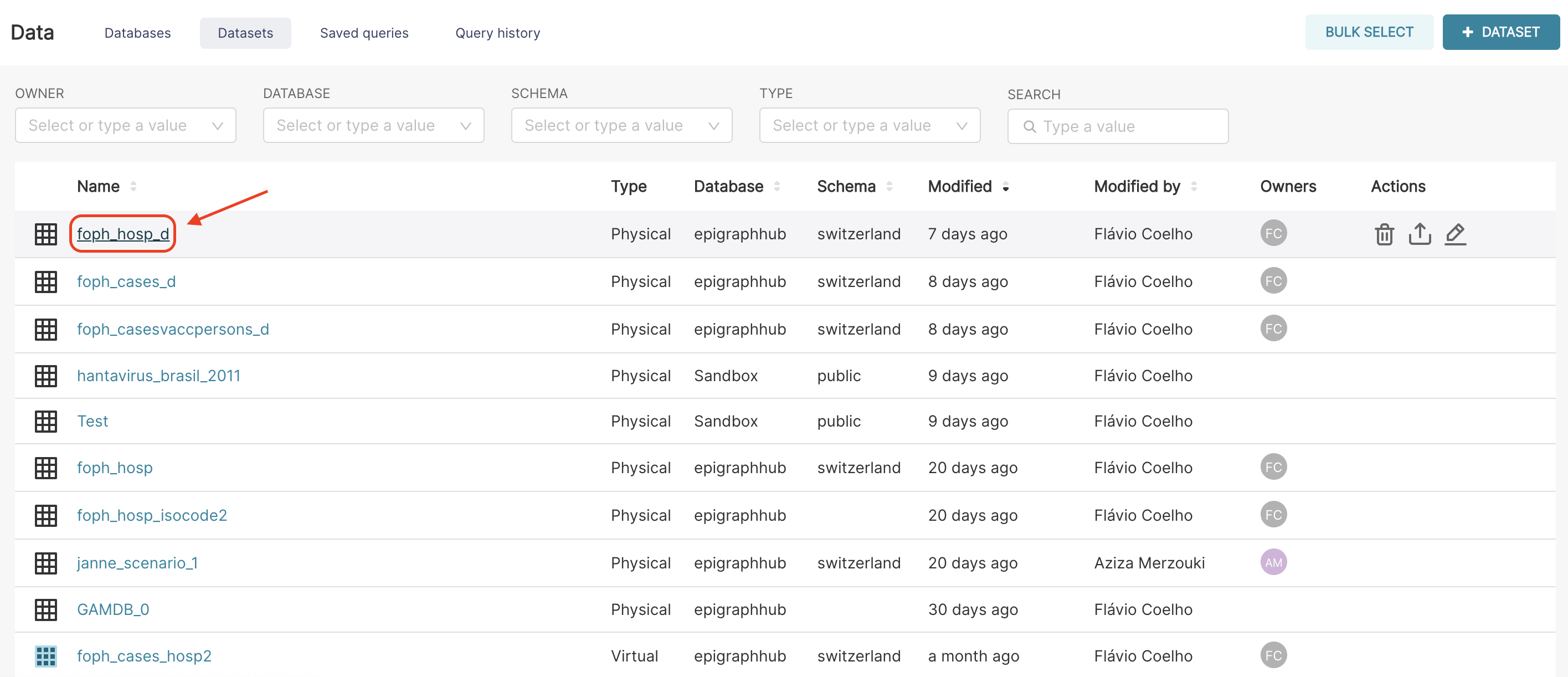
To select the dataset that we want to explore, let’s first go to the Data - Datasets page.

There, you can see the list of all public datasets, and you can click on the name of the dataset you want to explore.
For this lesson, we will use the example of the foph_hosp_d dataset. This dataset represents the daily hospitalisations of COVID-19 in Switzerland according to the FOPH (Federal Office of Public Health).
Explore page
After selecting the dataset, you will be on the Explore page, which is divided into three different panels.
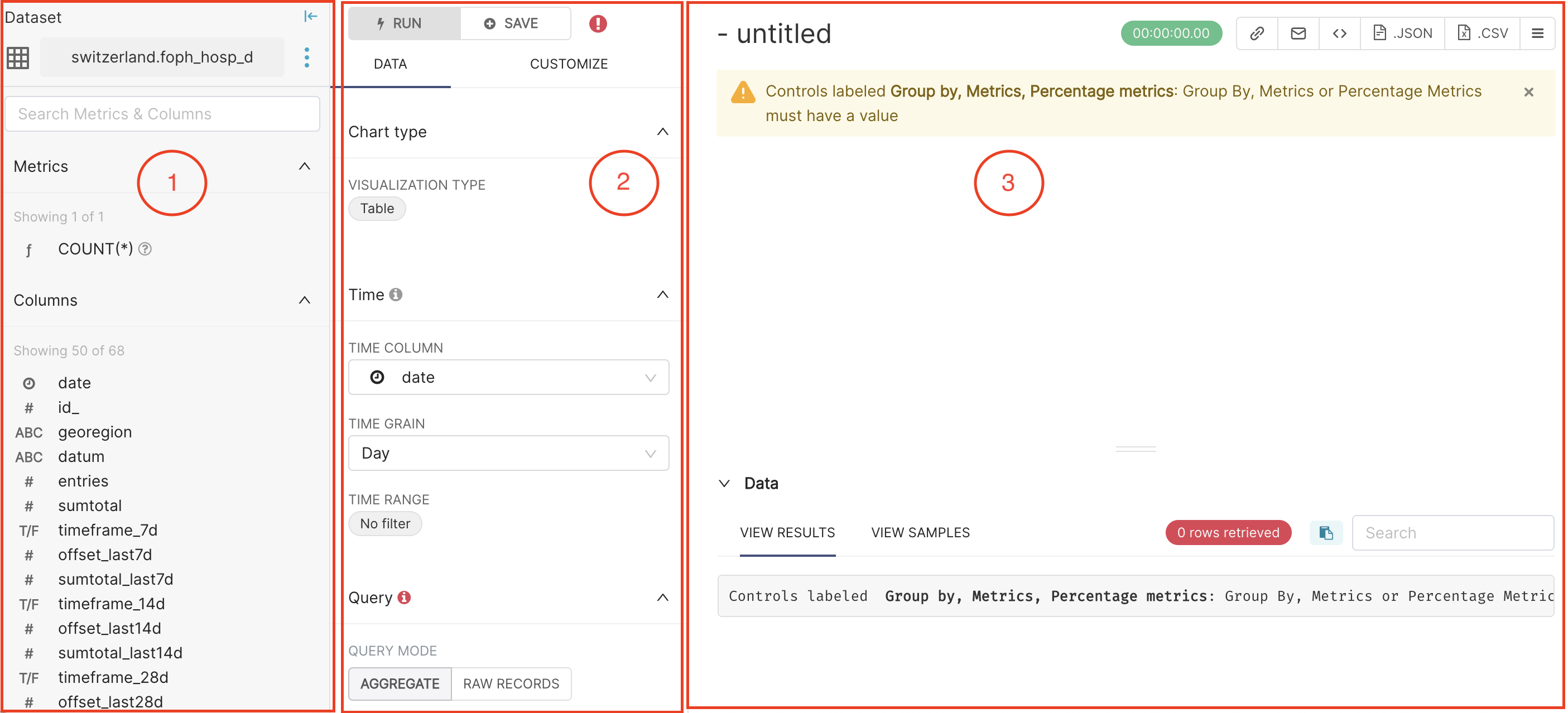
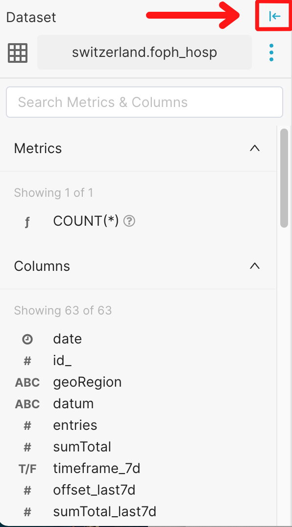
On the left panel, you can see the currently selected dataset (here switzerland.foph_hosp_d), and the list of Columns in the dataset. The data type of the column is represented by the small icon that is on the left side of each column name.
Clock: The datasource’s time column
ABC: Text data
#: Numeric value data
T/F: Boolean data True/False
In the middle panel, you can choose the visualisation type you want, specify the time granularity (e.g., daily, weekly) and time range (from X to Y) of interest. In this panel, you can also define the query that will be used to build your chart. The query allows you to define which data to include (e.g., Metric fields), how to organise them (e.g., Group field) and how to limit them (e.g., Row limit, Filter fields).
On the right panel, you can see the resulting chart and data generated by the query specified in the middle panel.
We can collapse the left panel to focus on the analysis (middle panel) and visualisation of the data (right panel), selecting the arrow icon highlighted below:
Let’s now have a closer look at the middle panel of the page. It has three different subsections: Chart type, Time, and Query.
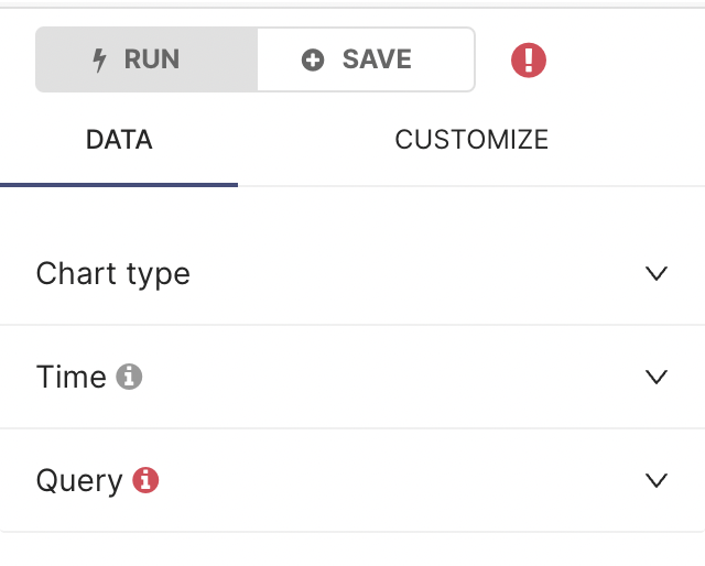
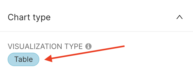
Chart Type
By default, the VISUALISATION TYPE is a Table. To see the different ways you can display your data and potentially change the chart type, click on the current VISUALISATION TYPE (Table).
You can see that a large number of other visualisations are available, such as Time-series, Box Plots, Maps, Bar Charts, Line Charts.
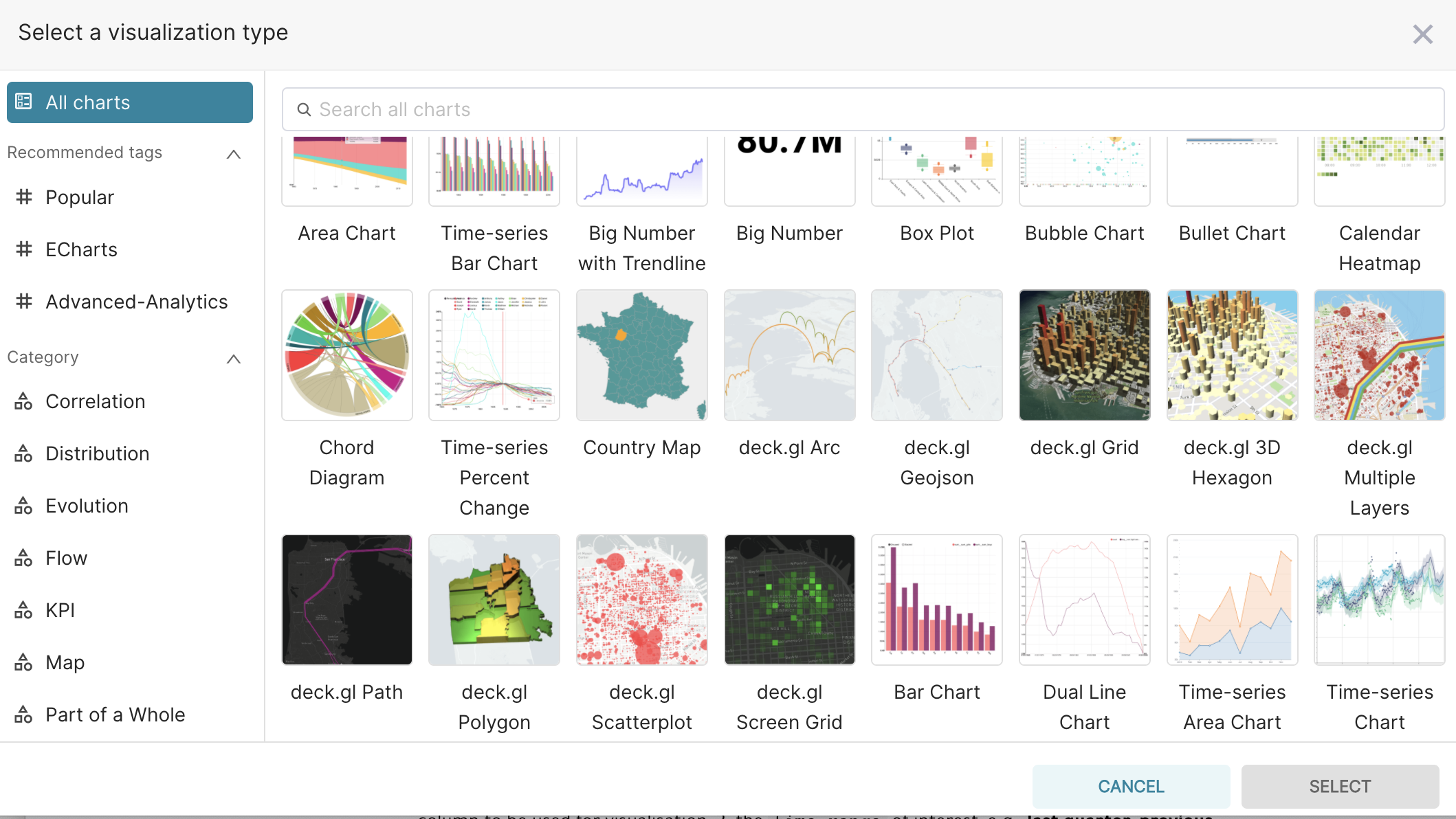
To find the visualisation that suits your needs best, you can either explore All charts available, or focus on the most Popular ones, or by Category of interest.
In the Data Visualization section there are examples of some plots done in the platform.
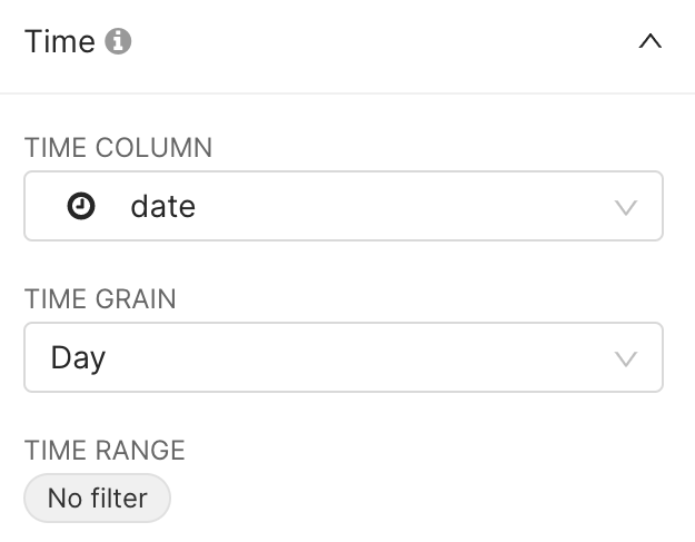
Time
In the Time section, three key fields are defined:
the TIME COLUMN to be used for visualisation,
the TIME RANGE of interest, e.g.,
no filter,last quarter,previous calendar year, or morecustomandadvancedtime ranges,the TIME GRAIN (granularity) to be used for instance in time evolution charts, e.g.,
daily,weekly,monthly.
By default we will now explore all (i.e. no filter on time) daily data, based on the date column in our table.
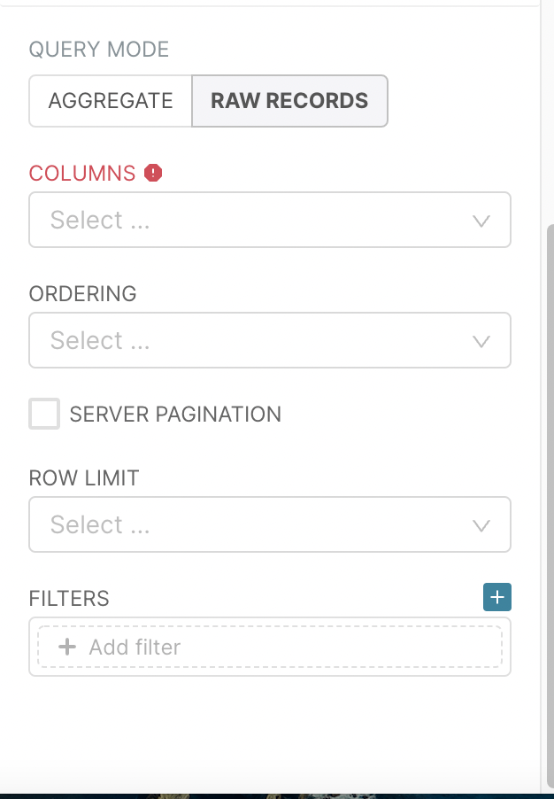
Query
Let’s now have a closer look at the Query section. This section presents two different ways of exploring the data (QUERY MODE) represented by the AGGREGATE and RAW RECORDS options.
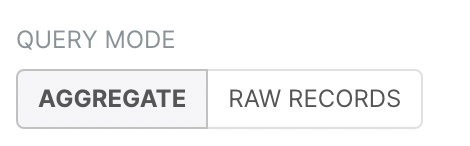
The AGGREGATE query mode allows the user to combine the information of multiple rows of a dataset, using some aggregate function (e.g. the
sumoraverage). The aggregation is made according to some columns in the dataset.In the RAW RECORDS option, you will just work with rows of the dataset without applying any aggregation operation.
Table Chart
In this section, for the table chart visualization, we will see an example with the RAW RECORDS mode, as a first exploration step of our dataset. When this option is selected you will visualise the fields below.
Columns of interest
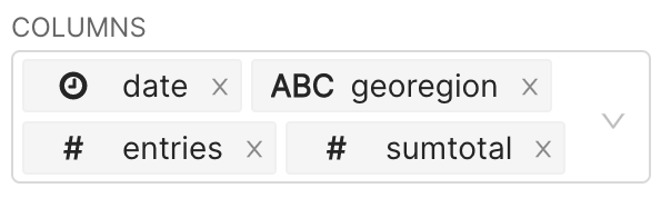
In COLUMNS, you decide what columns of the dataset you want to visualise. Let’s say we are interested by the date, geoRegion, entries and sumTotal columns. To select a column, click on the COLUMNS field, a drop-down list will appear, with all columns you can select from.
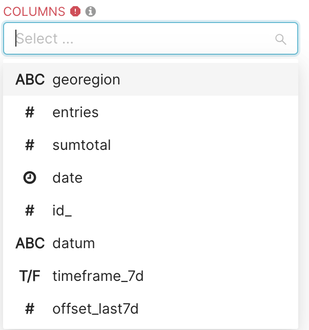
Go through this list, and select your columns of interest (here date, geoRegion, entries and sumTotal). The COLUMNS field should look as follows:
After selecting these columns in the COLUMNS field, you will notice that a button labeled RUN QUERY will appear on the the right panel of the Explore page.
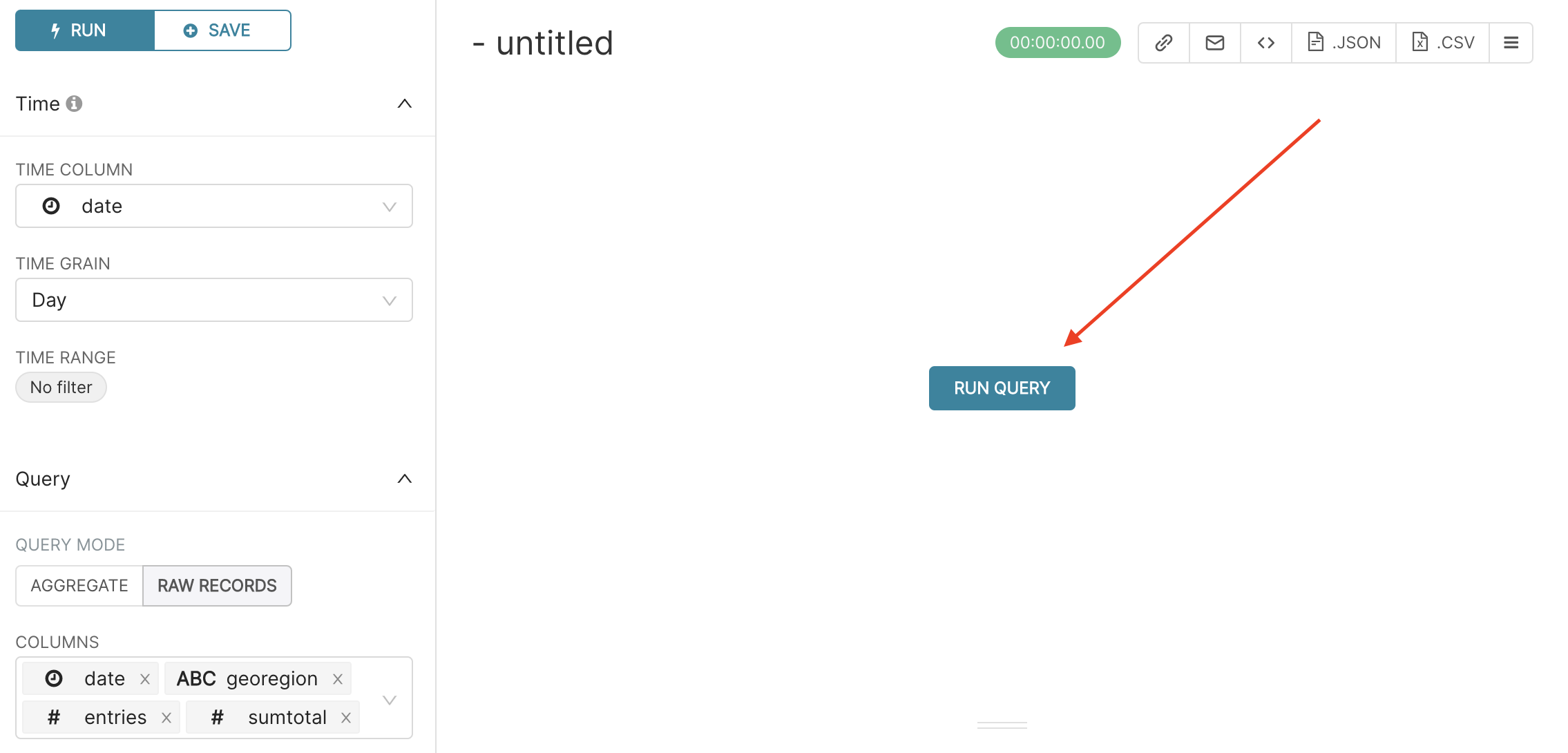
If you press this button, the table chart with the columns that you selected will appear on the same panel.
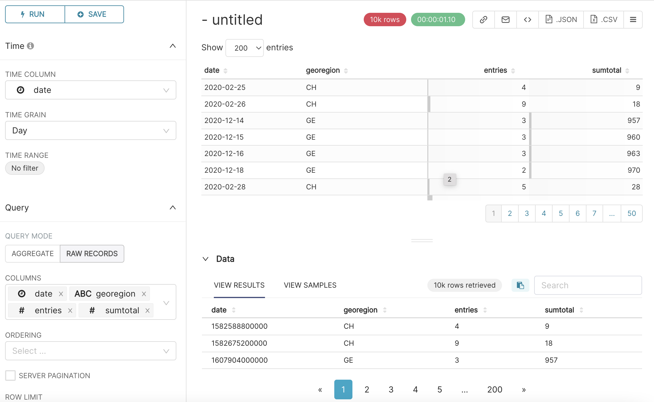
Under the table chart, Data resulting from your query also appear, with the number of data rows retrieved (here 10k rows retrieved).
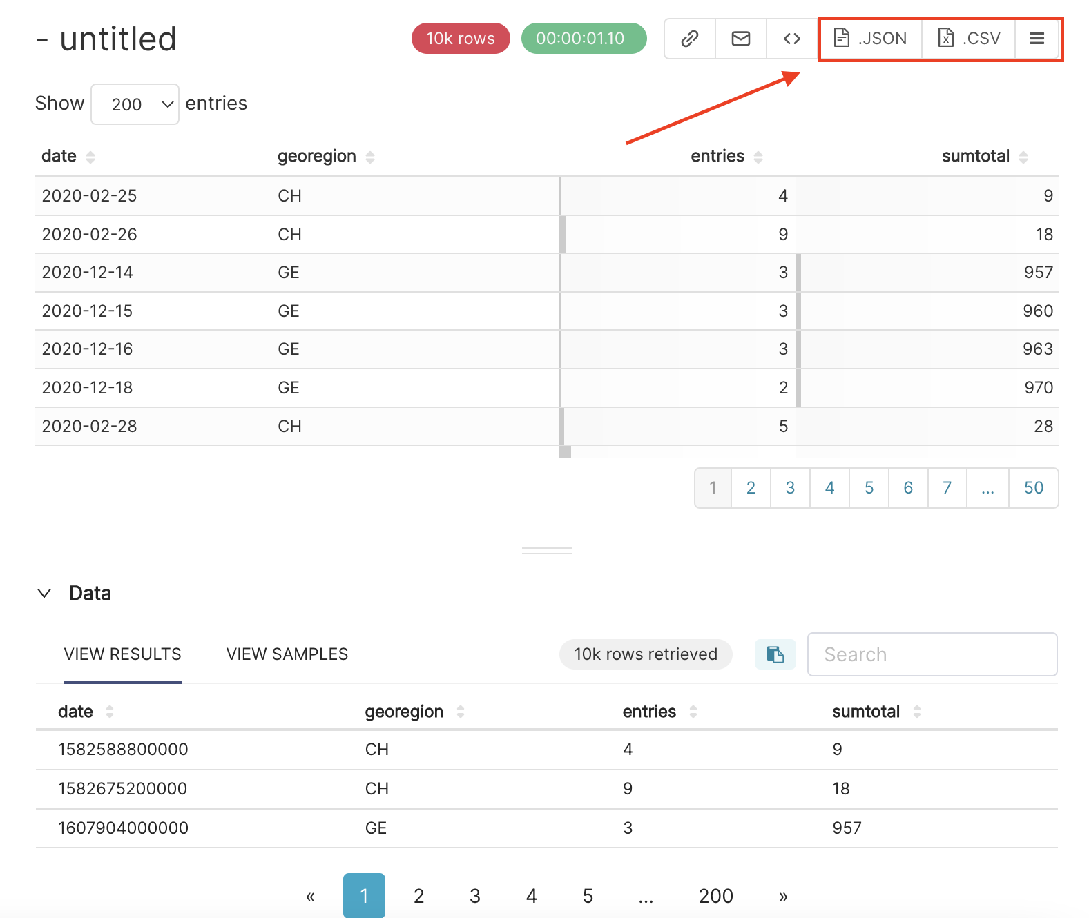
Save dataset
Once you get the table, if you don’t want to make any new explorations, you can export this table as a .JSON or .CSV file by pressing the corresponding button in the right upper corner.
But, we can still explore many other features, to get an insight on the COVID hospitalisations in Switzerland.
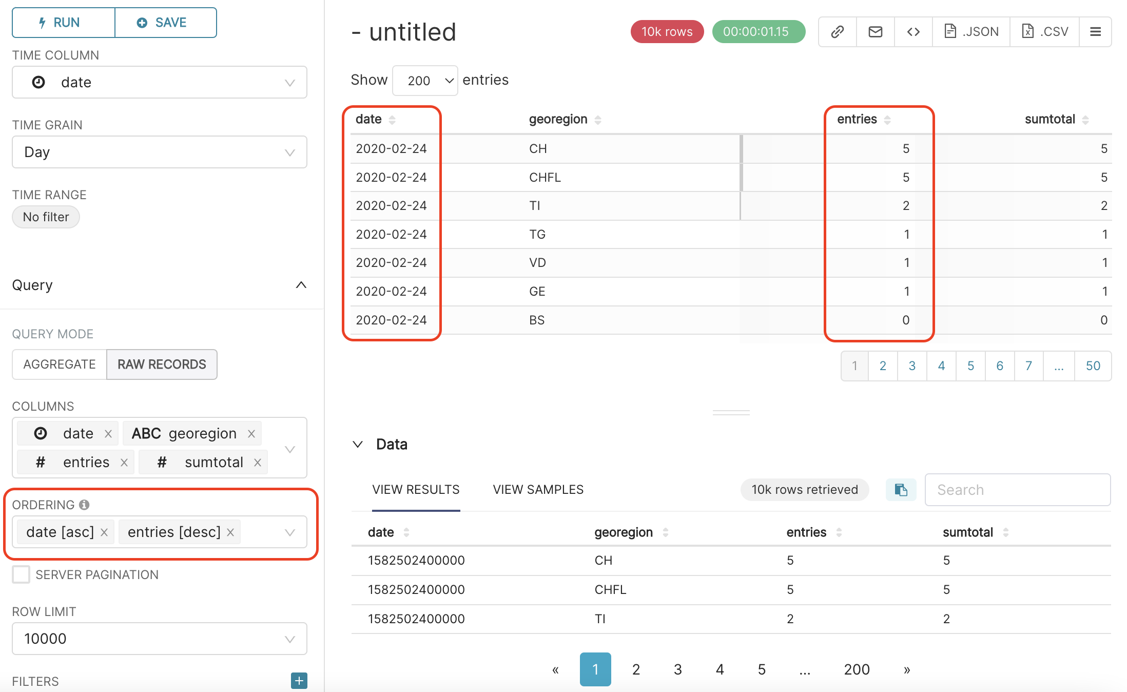
Order data
Right below the COLUMNS field, there is a field called ORDERING. In this field, you can order the dataset in ascending or decreasing order according to some column values.
For example, let’s order the dataset by the date column, in ascending order; click on ORDERING field and select data [asc].
We can add a second ordering level. For example, for each date, we can further order the rows by number of entries, in descending order. To do so, click again on the ORDERING field, and select entries [desc]. You should then get this result:
Limit and filter
In the ROW LIMIT field you can select how many rows you want to get from the data. We can keep it here to 10000, as follows:
In the FILTERS field you can apply many different filters in the dataset.
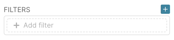
Let’s explore some of these filters.
After clicking on + Add filter the following window will show up on your screen:
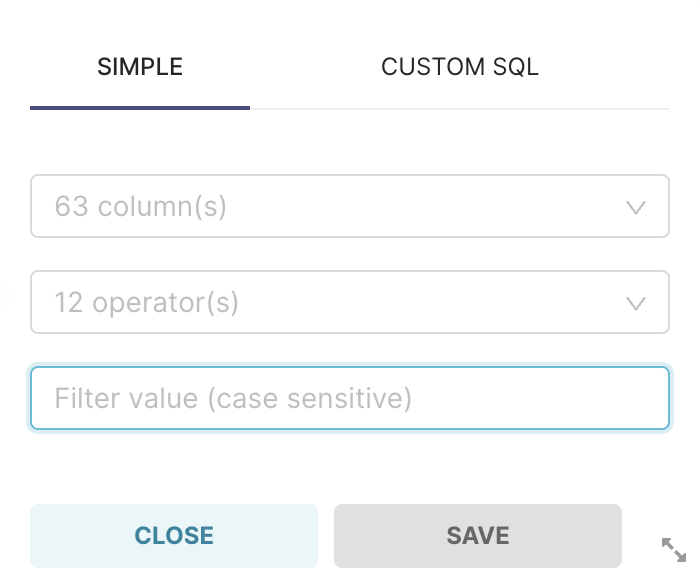
In the first field you can select the
columnon which you want to apply the filter. This option can be filled with any column of the dataset.The second field is related to the filter
operatoryou want to apply to the data.The third field is the
valueof reference for your filter.
We have the following operators available:
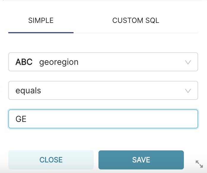
equals: You will use this operator to select only the rows of a dataset with a specific value. The operator equals can be applied for all types of columns. For example, in the case of the
foph_hosp_ddataset, you can use this filter if you just want to get the values in whichgeoRegion equals GE.not equals: We can use this operator to avoid some value. For example, if you don’t want to get the rows with entries equal a 0 you can apply the following filter:
entries not equals 0.< : This operator only can be applied in numeric columns. You should use it when you want the values returned in a column to be lower than some threshold defined in the filter value.
> : This operator only can be applied in numeric columns. You should use it when you want the values returned in a column to be bigger than some threshold defined in the filter value.
< = : This operator only can be applied in numeric columns. You should use them when you want the values returned in a column to be lower or equal to a threshold defined in the filter value.
> = : This operator only can be applied in numeric columns. You should use them when you want the values returned in a column to be bigger or equal to a threshold defined in the filter value.
IN : This operator can be used to select values in a column equal to some group of values. For example, in our example dataset, you could want to select the rows where the
geoRegion in (GE, FR). Note that you can choose as many values as you want.NOT IN: This operator makes the inverse of the
INoperator. This filter is used when you want the table returned to exclude the values added in the filter value.LIKE (case insensitive) and LIKE : This operator can be used to select values in columns with the text values following some pattern. The difference between the LIKE (case insensitive) and the LIKE is that the first operator (insensitive) doesn’t differentiate between the upper and lower cases.
IS NOT NULL : This operator is used to select only rows with non-null values according to some column.
IS NULL : This operator is used to select only rows with null values according to some column.
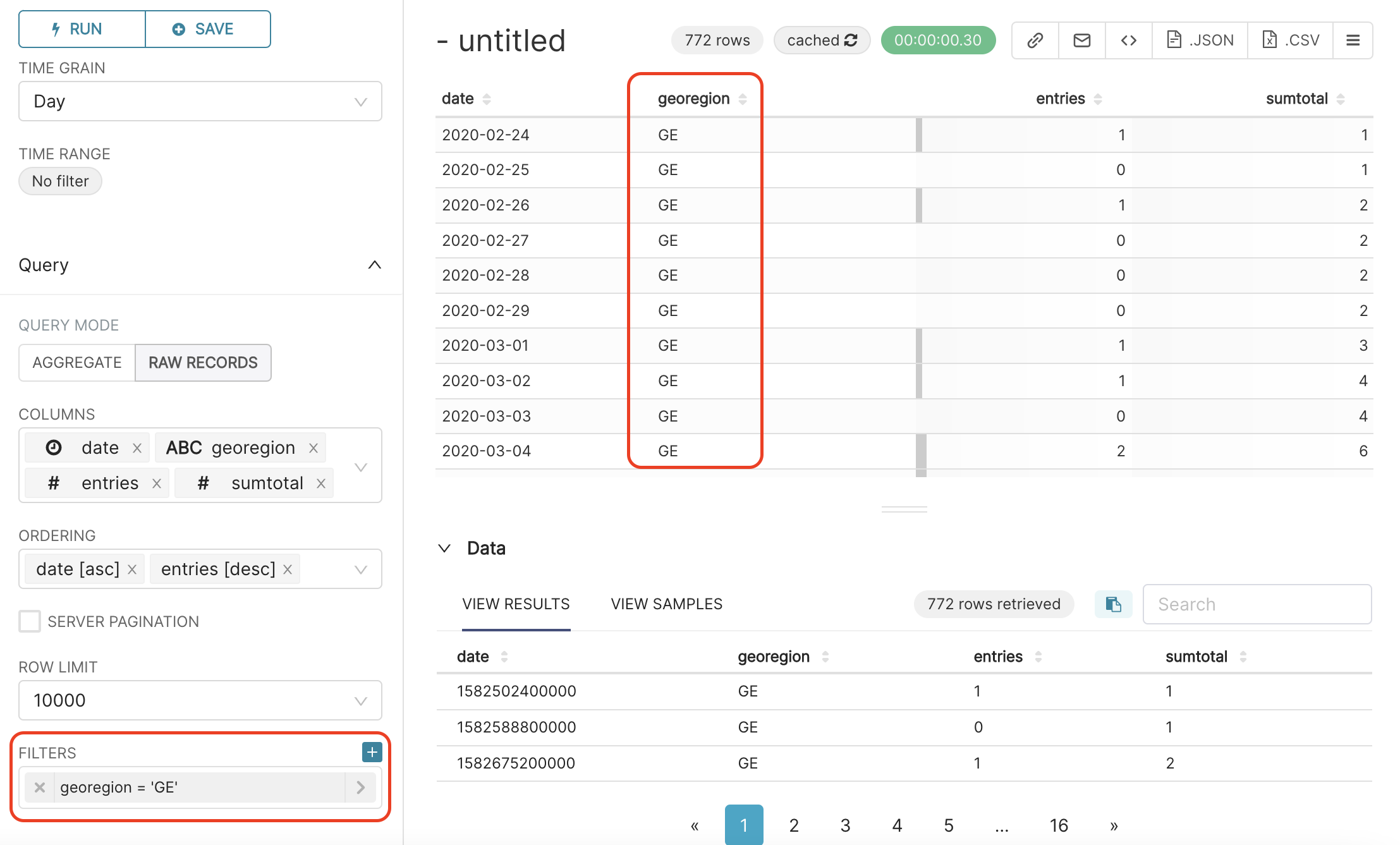
For example, in the case of the foph_hosp_d dataset, let’s use this filter to get the rows in which geoRegion equals GE, as follows:
After configuring the filter you need to press the SAVE button and the RUN QUERY button again. You can see the result of applying this filter below:
In our platform, we can apply multiple filters at the same time.
For example, in the dataset foph_hosp_d, the column sumtotal represents the cumulative number of hospitalisations. Let’ filter the data to keep only rows where the cumulative number of hospitalisations exceeds 100.
To do so, click on the + icon on the right of FILTERS field, and add the filter sumtotal >= 100), as shown below:
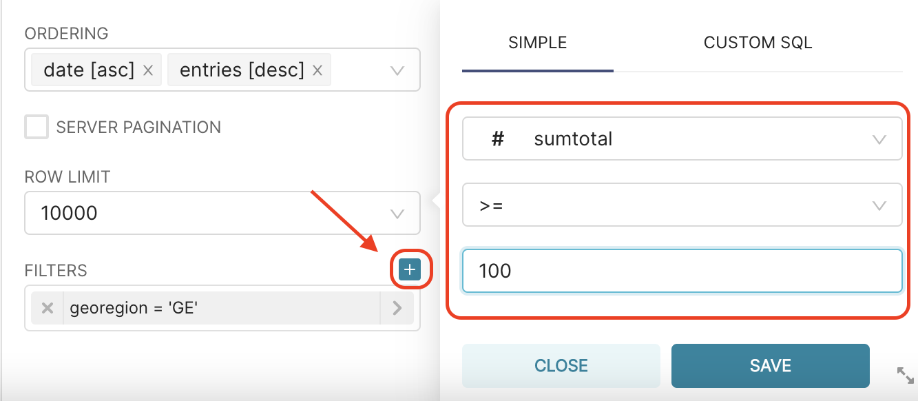
And that’s the result:
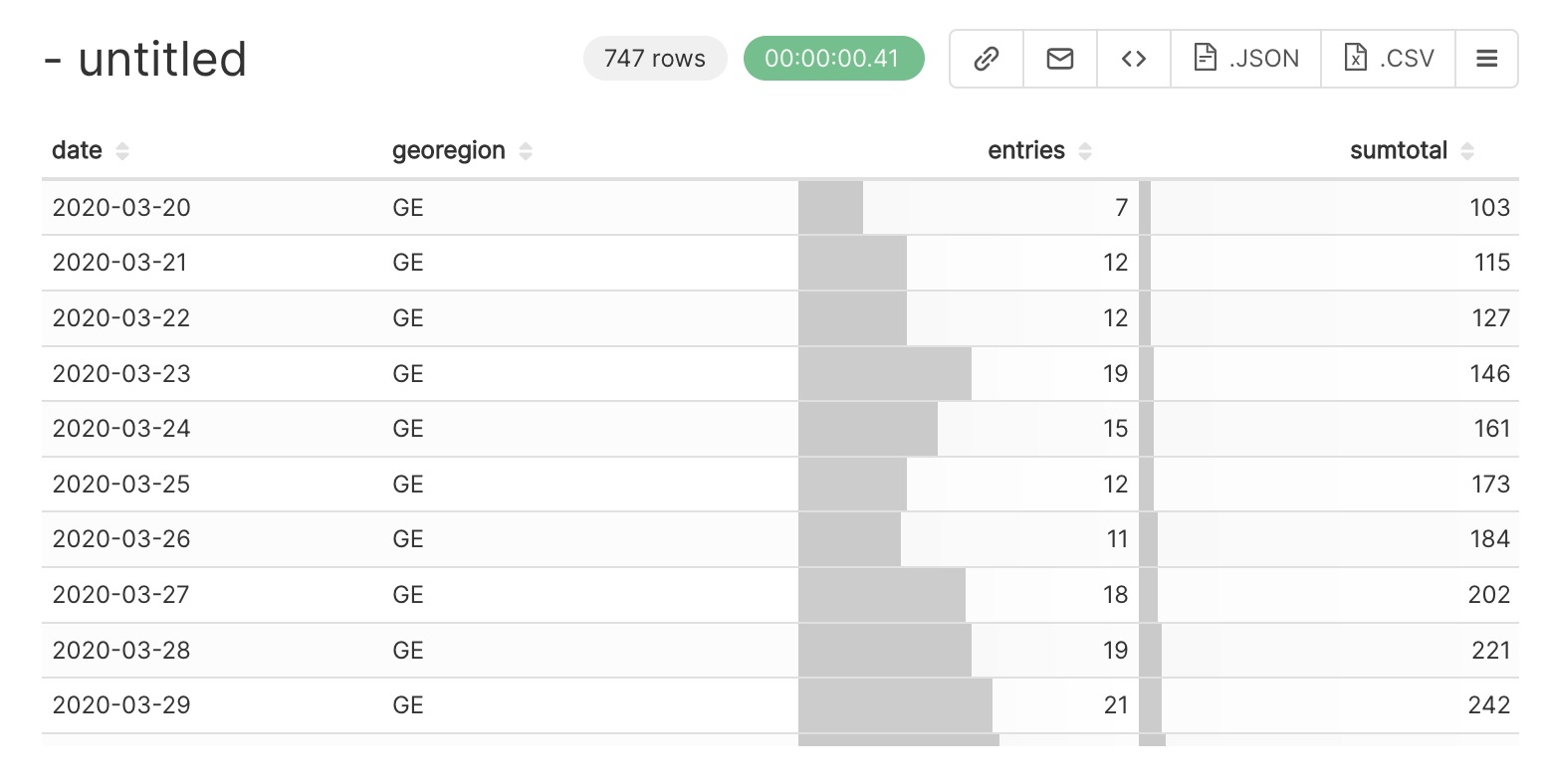
When you scroll down the table chart, you can already see clearly the first COVID wave, which started end of March 2020, and the more impressive next waves, i.e. around October-November 2020, and beginning of 2022!
Go to the Data Visualization section to learn how to create other visualizations.