Bar Chart
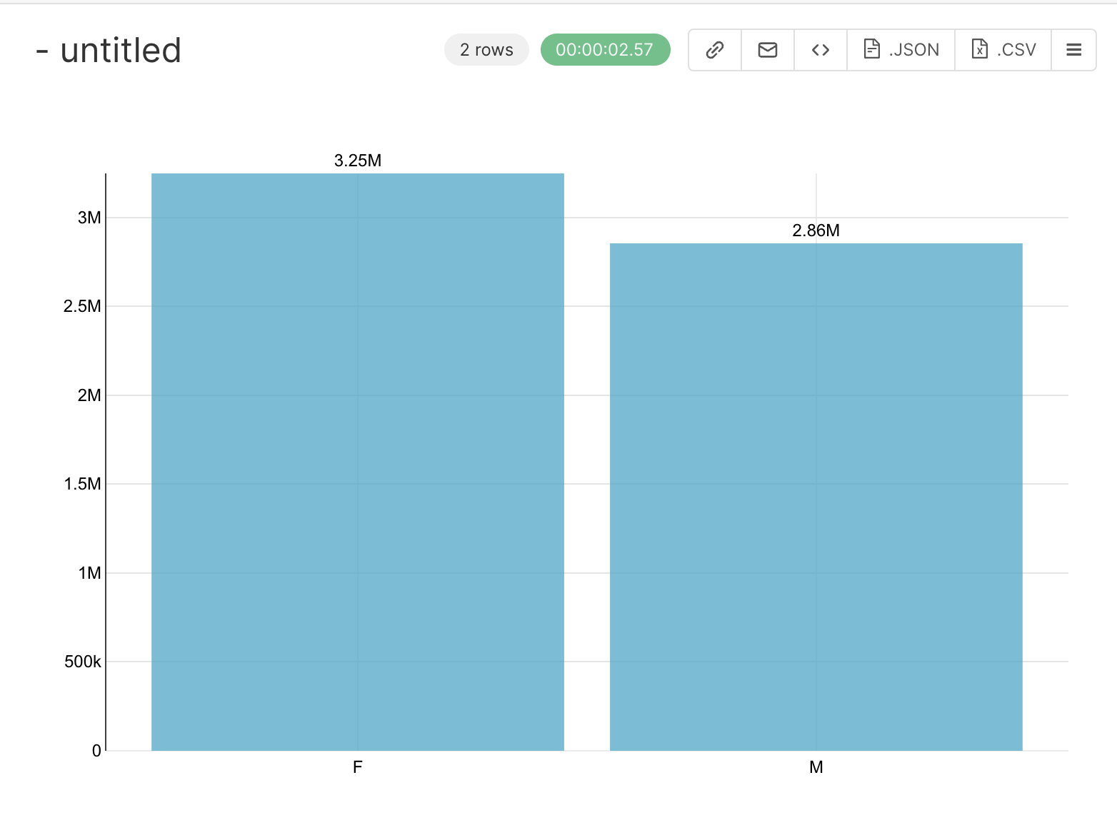
The bar chart can be used to visualize the count of unique values in a column. Let’s use the positive_cases_covid_d dataset. We will plot the count of the unique values in the column sexo.
To do this, open the positive_cases_covid_d dataset and click on the Table value to change the VISUALISATION TYPE:
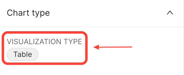 {width=300px}
In the window that will open, type bar chart:
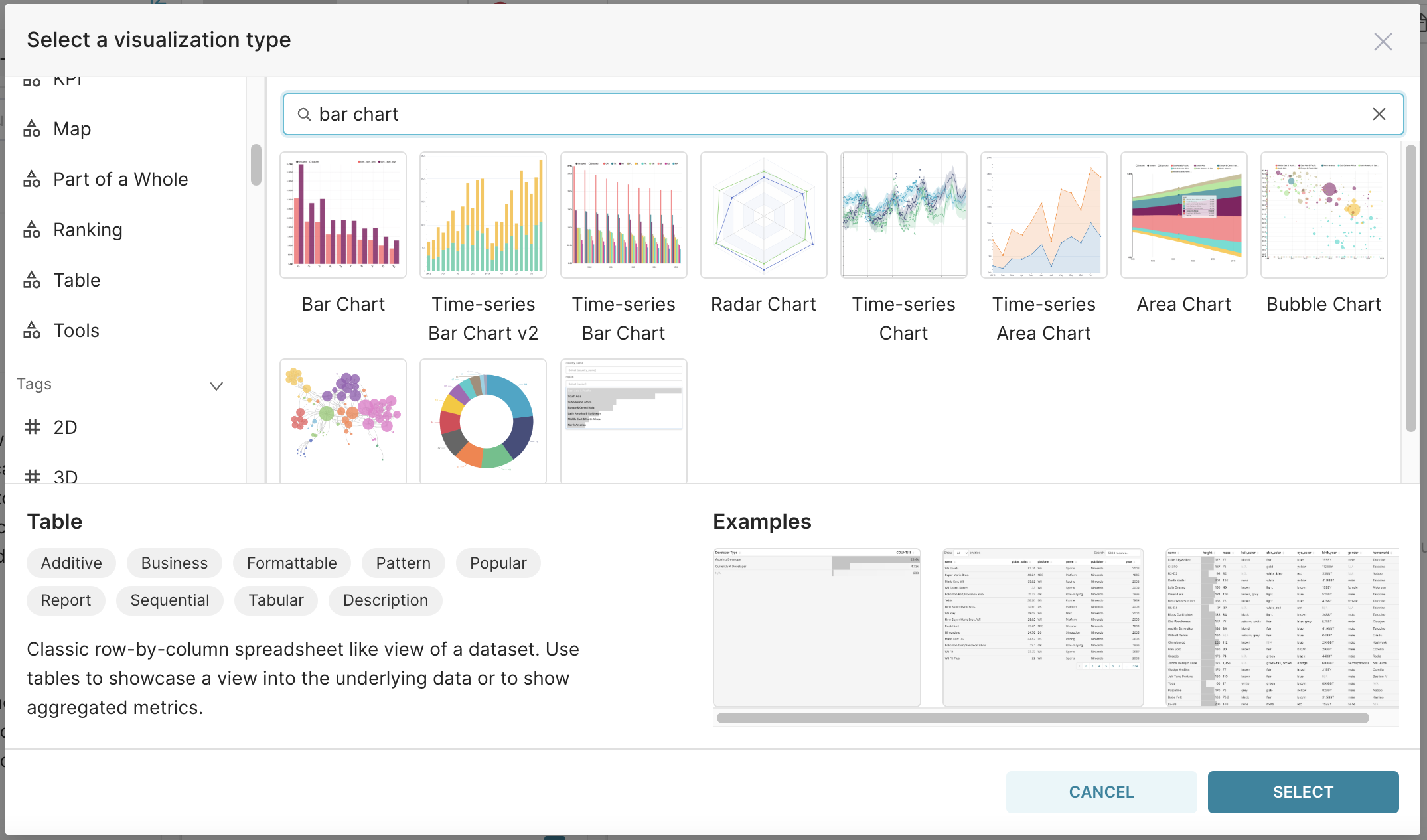 {width=750px}
Click on the bar chart and on the SELECT button.
So, in the SERIES field, select the columns that we want to plot the values, in our case sexo, and in the METRICS count the lines aggregated by the values in SERIES using the metric COUNT(*), to count all the lines returned.
So, your final query configuration is:
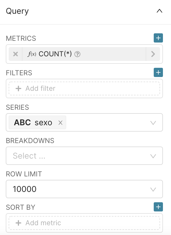 {width=300px}
After config the query, type RUN QUERY an the following result will be displayed in your screen:
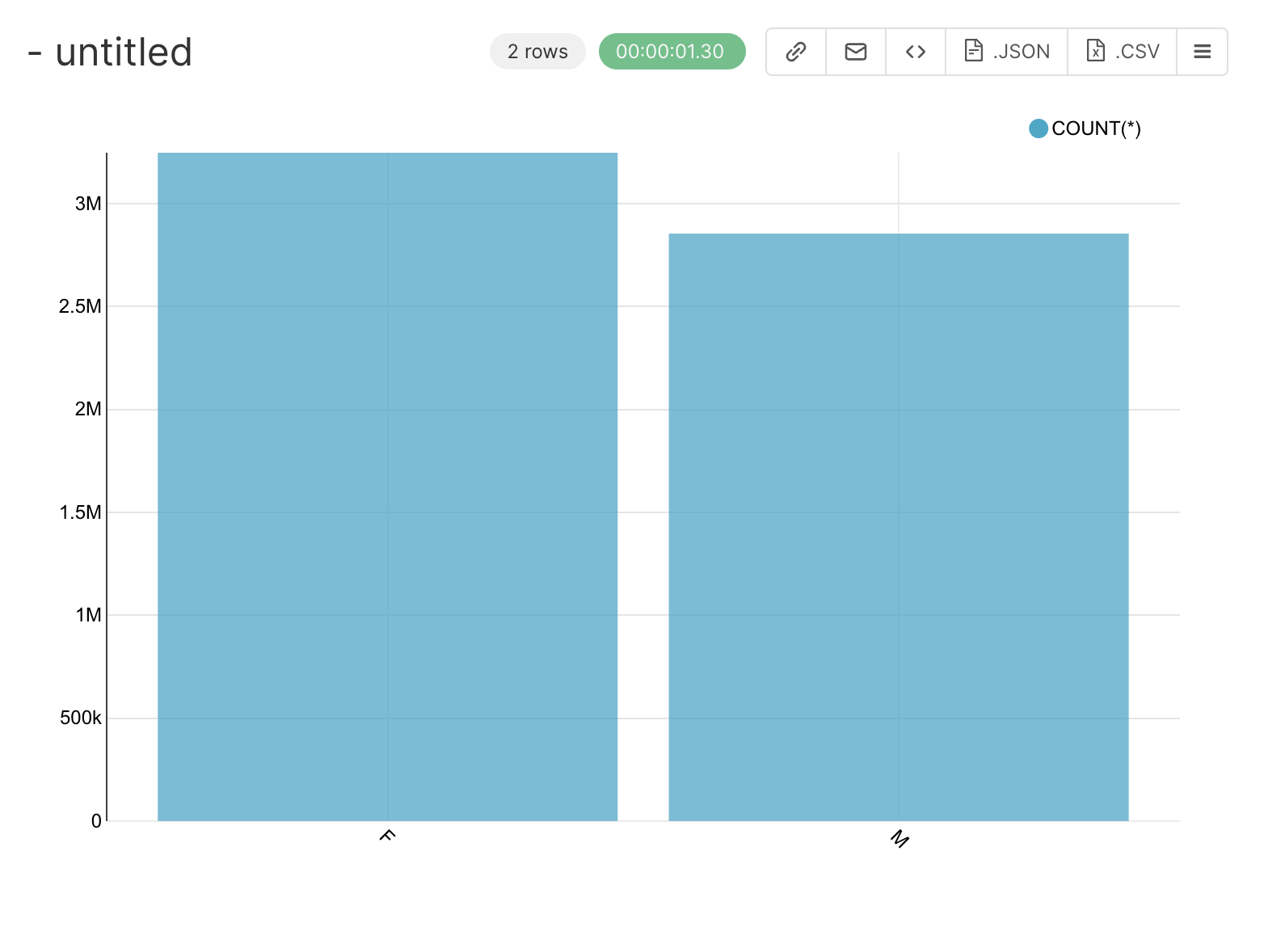 {width=300px}
You can improve your plot by going to the CUSTOMIZE tab and ticking the BAR VALUES field and selecting flat in X TICK LAYOUT. Applying this configurations your result should be:
 {width=300px}
You also can change the color of your bars in the COLOR SCHEME (in the CUSTOMIZE tab) and apply filters in the FILTER section (in the QUERY section) to count the values in specific conditions.
It is now time to :
Specify a title for the chart, for instance
Total number of COVID-19 cases by sex,Save it, by clicking on
+SAVEbutton in the middle panel.